When it comes to gender, most people have a similar understanding of it in their minds.
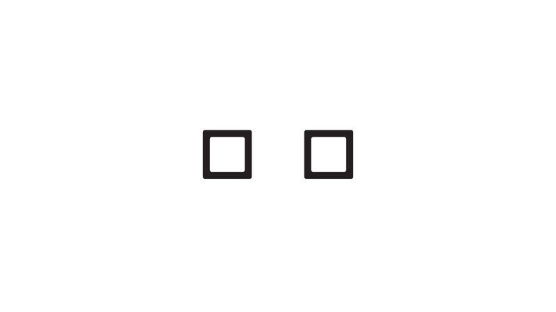
It looks something like this:
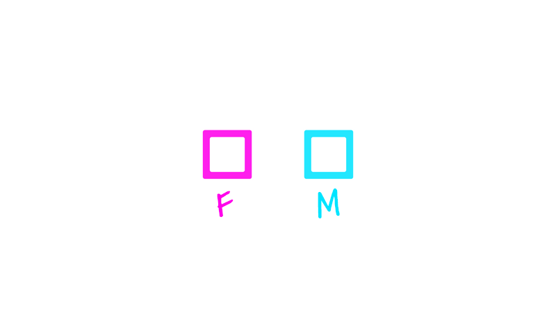
For some people, this won’t be enough. They might need a couple of letters and some stereotypical color to fully encapsulate the idea.
This should do it:
Most people don’t need them labeled. They see two checkboxes, and they instinctively know that one represents “Female” and the other “Male.”
I’ve drawn two boxes on chalkboards hundreds of times, asked the group what they mean, and they get it every time.
In some cases, there’s a mental image of a third box. Maybe it was seen on an application for something, or in a survey. When the third box is present, it’s usually labeled the incredibly unfortunate “Other.”
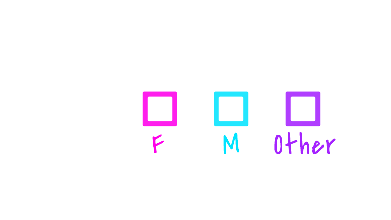
Oof. Nothing says “we don’t recognize your humanity” like making you check a box way off to the side, haphazardly thrown in, that literally others you.
Anyhow, that’s it. That’s the end of most people’s understanding of gender: there are only two, they fit neatly into two boxes, and everyone can be represented by checking one, or they get put into the “other” box.
That’s the starting place for most people — across most demographics like age, race, nationality, ethnicity, and religion — when it comes to their understanding of gender.
But a lot of people recognize the limitations of this. That’s why it’s just a starting place.
They see how a lot of people don’t fit nicely into one of those two boxes. Or they notice in themselves some friction with the box they’ve been put in. They might see themselves as combinations of both boxes, or existing somewhere between them. And they recognize how “other”-ing people isn’t a solution, but a whole different problem.
That’s where the spectrum idea comes in:
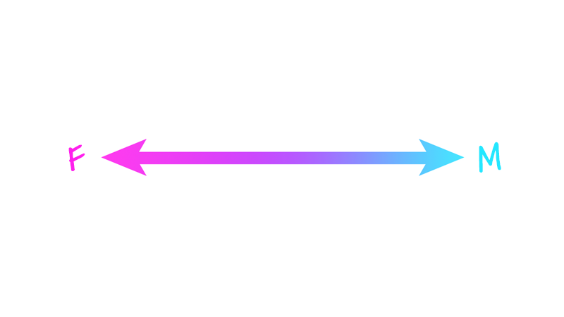
This is how a lot of people, including about half of millennials, see gender: as existing on a spectrum.
The idea here is that we all land somewhere on that line.
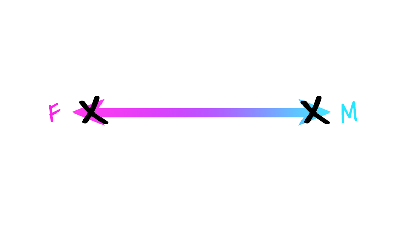
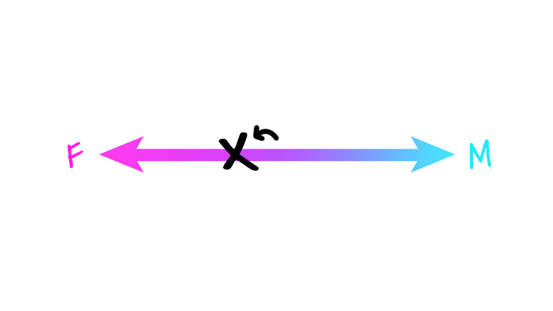
Some people will see themselves as best represented out on the extremes — representing 100% female/woman, or 100% male/man:
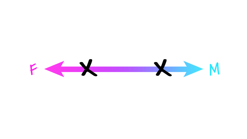
For other people, their sense of self, and how gender is constructed for them, will land them more toward the middle left or middle right:
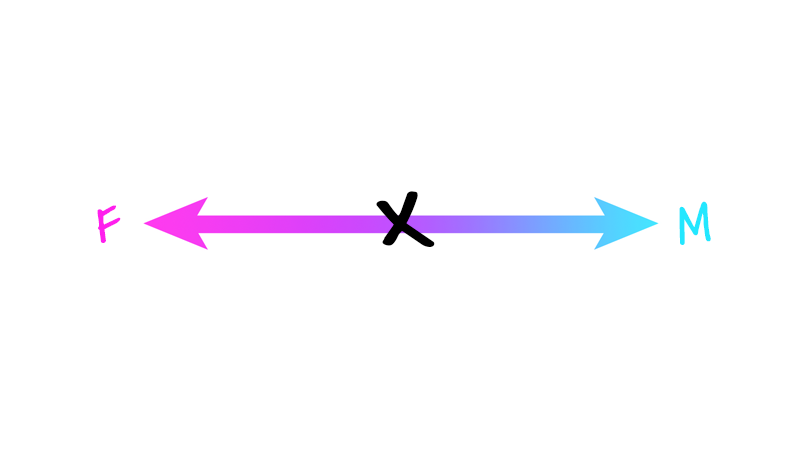
And what happened to those people who, before, were pushed off to the side? In the “Other” box? They might see themselves as right in between the two poles, where the purple is now:
Without question, this representation gives us a lot more wiggle room than the boxes.
There’s room for the people who, before, were “other”-ed. It doesn’t say there are only two ways for someone to be, but instead that there are tons of shades of difference that make up who we are as gendered people. And this is all great, because it recognizes the diversity inherent in people.
But thinking about gender as existing on a spectrum also presents some issues.
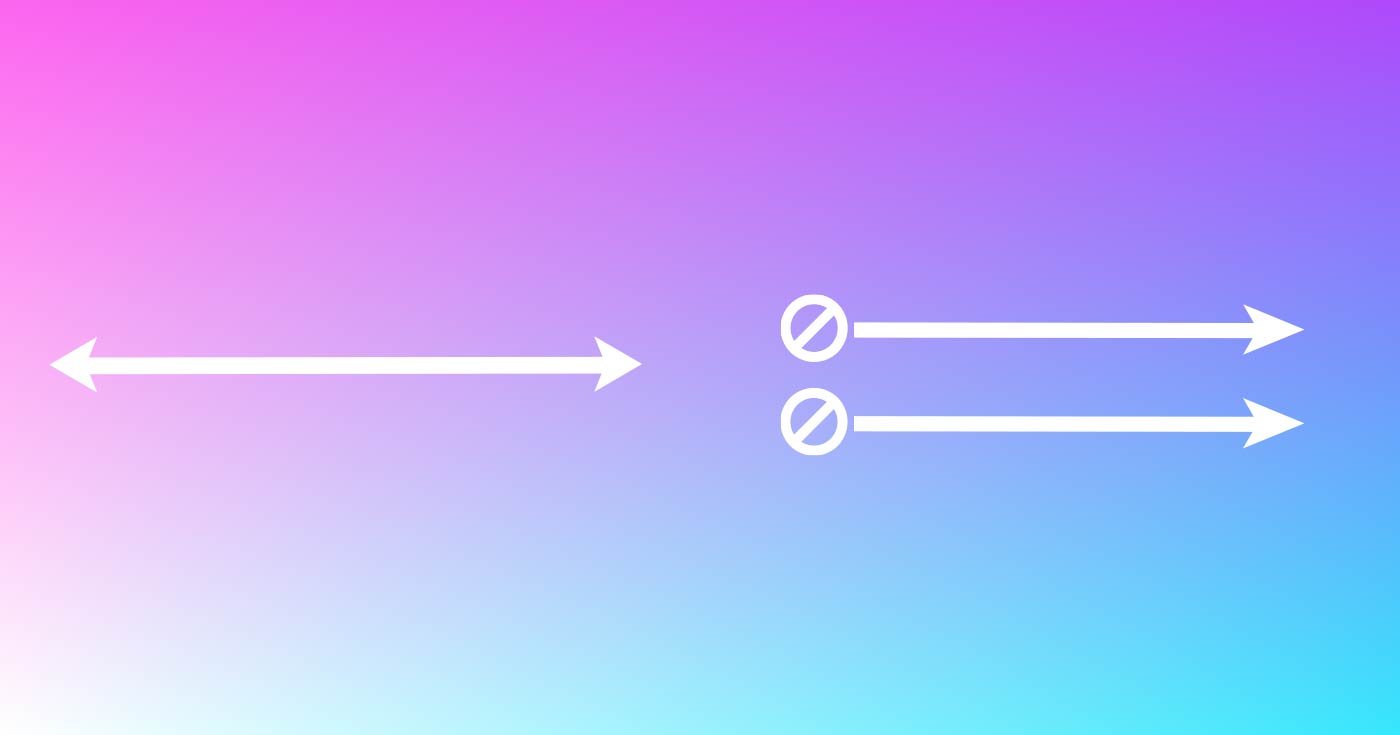
For example, this visualization suggests that in order to be more of one pole, you need to be less of the other. To be more feminine, you need to be less masculine. But is that really how it works?
If someone is wearing nail polish, which I was taught to be feminine…
…and they were also wearing dirty work boots, which I was taught to be masculine, do they cancel each other out?
Zeroing back out to “neutrality”? Neither masculine nor feminine?
No, they exist side-by-side. Nail polish doesn’t cancel out work boots. Someone can simultaneously express both femininity and masculinity.
But we can’t easily show that on a spectrum. It forces us to think either/or, instead of both/and.
Further, what does the middle even mean? If a person says “I’m right here, equal distances from the female and male poles,” what are they saying?
Does the middle of the spectrum represent someone whose gender is equally “Female and Male”? Does it represent someone who doesn’t identify with either of those concepts, “Neither female nor male”?
Visually, both of those explanations add up. It would be easy to think the middle of the spectrum meant either of those.
And as far as those ways of identifying or seeing oneself, both are also valid. They’re experiences that people have. So they should both be able to be represented in whatever our mental model is for gender.
But most important here is to recognize that those are two very different ideas, and on a spectrum, they are both represented by the same point. Not ideal.
That’s where the scales come in:
This was my big addition to the gender conversation.
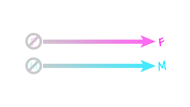
Visualizing gender on scales, or individual continua, instead of on a spectrum or as checkboxes, gives us even more room to capture the complicated and diverse ways gender shows up in our lives.
Instead of one spectrum with two different ideas at the poles, we’ve separated the ideas entirely. This resonates with a lot of people, because, well, they’re separate ideas.
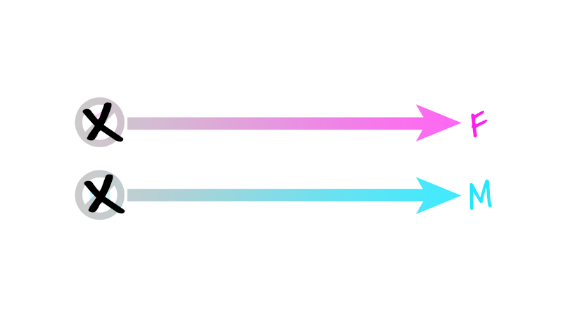
ot;Not M" to "M", with an X plotted at the 100% point of the "F" scale” class="wp-image-3748 lazy-load” data-srcset=”/wp-content/uploads/2019/02/scales-2.png 800w, /wp-content/uploads/2019/02/scales-2-300x169.png 300w, /wp-content/uploads/2019/02/scales-2-768x432.png 768w” sizes=”(max-width: 800px) 100vw, 800px” />
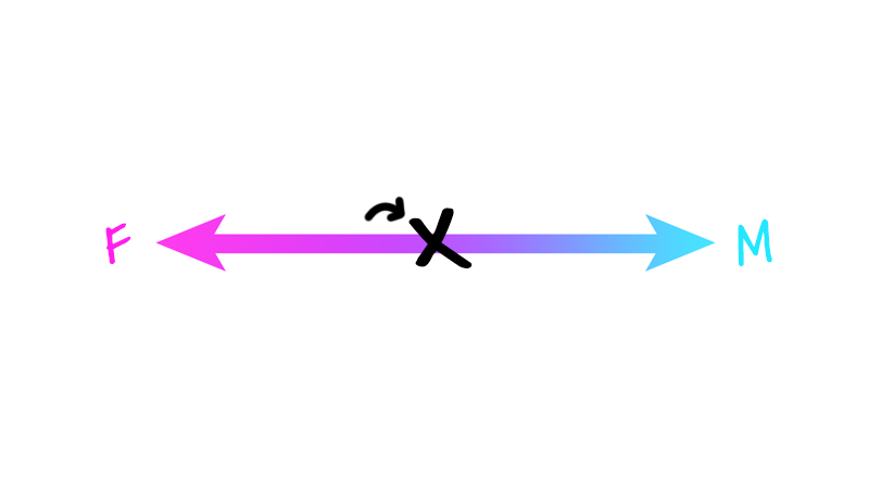
Or more toward the middle, the “about half of that,” or 50% point:
But this way of thinking about gender also allows someone to say something else altogether. You can say, “I’m a bit of this, and a lot of that”:
Because this way of thinking about gender liberates us from the idea that to be more of one thing, you have to be less of the other.
You can express a lot of femininity and masculinity, or not a lot of either. You can identify with a lot of the traits of woman-ness and man-ness, or a little of one and a lot of the other. And so on.
In every case, these different experiences don’t cancel each other out: they exist side by side with in us, a concoction of beautiful complexity, that sounds a lot like the human condition.
“But,” you might be thinking, “what happened to the purple? Are we re-othering the ‘other,’ that was centered — even if confusingly or problematically — before?”
Nope, nope, nope! The exact opposite is true.
Remember how we had two competing ideas of what the middle, or the purple, might represent? Well, there’s room for both of those people here, and we can easily distinguish between the two experiences.
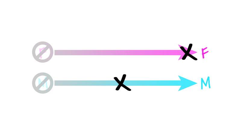
The person who doesn’t identify with either woman or man can simply say “nope” to both of those constructs:
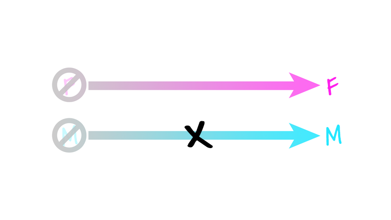
And the person who, before saw themselves in the middle, meant that they identified strongly with both of those concepts, has room here too:
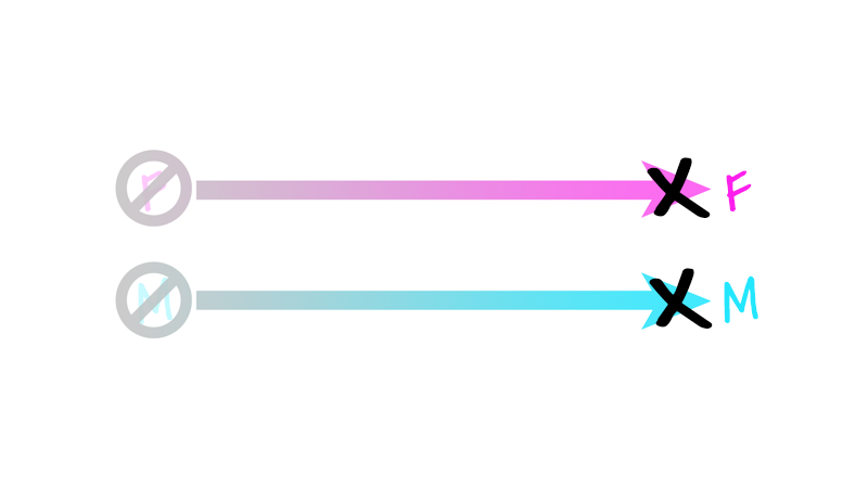
Purple is but a combination of blue and pink, after all.
What we’re doing here, in a really simple way, is representing something that is far more complex.
Something that could otherwise be visualized like this:

But if you asked 10 random people, “How would you plot your gender in a 2-dimensional plane, where the Y axis represented your sense of woman-ness, and the X axis represented your sense of man-ness?” you would probably get 9 blank stares and 1 cold shoulder — and tha’ts if you were lucky.
But the scales, or the “-Ness” idea of gender, as I like to call it, is something that easily clicks with people — even 3rd graders.
Thinking about gender this way is more inclusive. It creates room for more people of different genders.
It’s also more accurate. It better captures how we actually experience gender — both in our own identities, and in how we interface with the world around us.
And, all that said, it’s still not perfect. It leaves some people out. It depicts things a lot of people would rather not opt into.
It’s not utopian, or a vision of the future society we might someday inhabit. It’s just the most accurate, honest, realistic depiction of the one most of us live in right now.
At least the most accurate one I’ve stumbled across.
I don’t see this as the end. Just a different beginning.
Hey friend: I wrote the beginnings of this post for the Safe Zone Train-the-Trainer Retreat Guide. Go check that out if you want to roll out an LGBTQ+ training program in your community.